Monospace Fonts with Coding Ligatures
published on , last updated on , written by q. Thai “RPGReki” Chung, checked with and LanguageToolCoders use monospaced fonts. That's just how things are. It makes it easier to align code. But not all monospaced fonts are equally well suited for coding. So what makes them different? Why should I choose one font over the other? Let's have a look!
Font Features
Let's call it features: what do I need from a font? First, a font needs to be easily readable. I need to be able to read the words, but I also need to be able to discern similar characters, like and O. Or 1, l and I.
Also, I like a uniform look on my systems, so I want to use that font or the font it's based on outside my editor, e. g. on my terminal. So I want it to support as many natural languages as possible. Or have a usable fallback that blends well.
Then, I want it to have cool coding ligatures. They seem like unnecessary eye candy at first, but after using them for a while, you notice their existence makes it easier to read your code.
I have a look online. I quickly found 5 Monospaced Fonts with Cool Coding Ligatures on Better Web Type. All the fonts mentioned there have ligatures, so it's just about choosing which font looks best and which font supports the character set I need. They also have more detail on what makes a font more readable.
Ligatures
OK, before we dive in: what on earth are ligatures? Basically, it's a font feature where the software you're using should automatically replace certain letter combinations with other ones. For most languages, it just makes the text look prettier. For other languages, it's a central feature that makes having the language on computers even possible.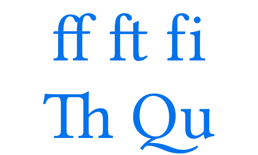
As for what can go wrong when your software implements support for those, have a look at The Effective Power Bug: Why Can Weird Text Crash Your iPhone? by Tom Scott.
Fira Code
Fira Code is the most popular font for coders. It was first released in 2015 and is based on Fira Mono from Mozilla. I've tried it before.
The similar-looking characters are distinct, and you can easily recognize which of the characters you're looking at. If you see an isolated l, you know it's a lowercase letter l without seeing a capital letter I or a number 1 in context. Capital letter O and number 0 look very distinct as well.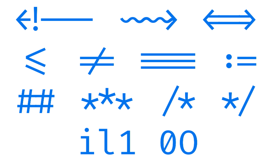
But with natural language support it falls apart. It's missing a lot of glyphs in the Latin-extended set. So I'm passing on this one for now.
Hasklig
Hasklig is Source Code Pro plus only few ligatures.
Like with Fira Code, similar looking characters are distinct, and you can easily recognize which of the characters you're looking at: if you see an isolated l, you know it's a lowercase letter l without seeing a capital letter I or a number 1 in context. Capital letter O and number 0 look very distinct as well.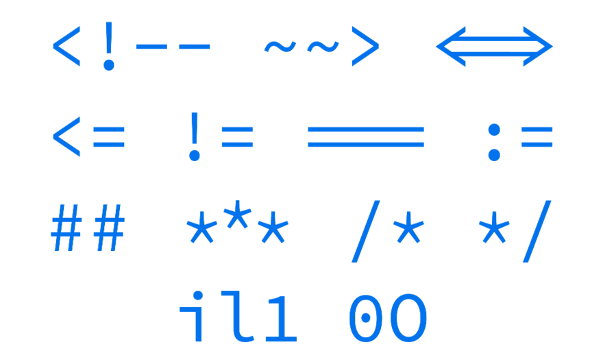
Source Code Pro and by extension Hasklig support lots of natural languages. But with the small number of ligatures, I'm skipping over this one.
Iosevka
Iosevka has lots of options. It supports more naturals languages than Fira Code, but its ligatures aren't looking as nice. It's more condensed, so you can fit more text into one line. But that makes it slightly harder to read.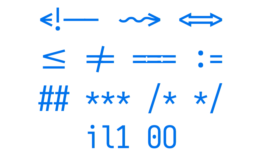
What made me shy away is that the similar looking characters look too similar. If I'm not used to it, I could easily mistake a lower case l for a number 1. Similar with capital letter O and number 0. Though the latter isn't that much of a problem for me, over the years I've just come to expect zeros to be crossed or have a dot in them.
JetBrains Mono
JetBrains Mono is a very boxy monospaced font featuring very well-designed ligatures.
The similar looking characters are distinct enough. If you see an isolated l, you know it's a lowercase letter l without seeing a capital letter I or a number 1 in context. Capital letter O and number 0 don't look very distinct. Making them more distinct doesn't fit into the look of the boxy aesthetic of the font.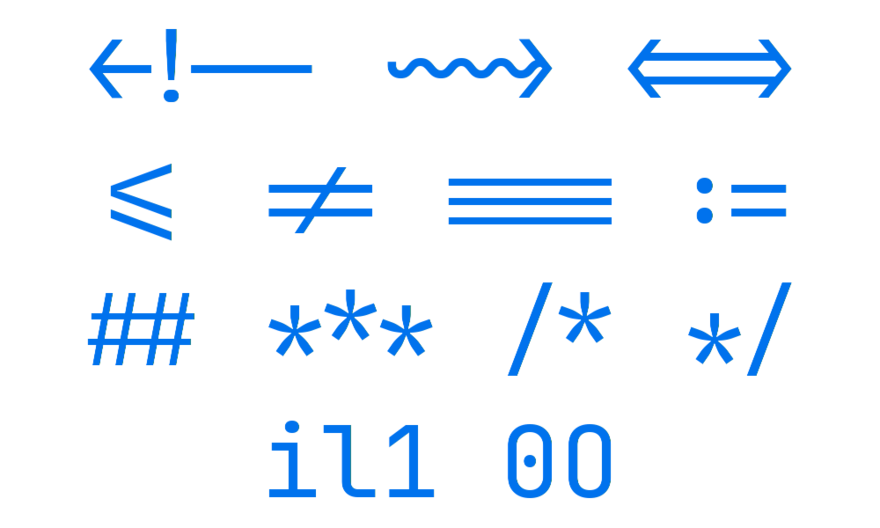
Conclusion
In the end, I've skipped over Monoid, as I have chosen to use JetBrains Mono. I like the boxy look of the font. The font is so readable I'm even choosing to use the Light or Extra Light font weights over the Regular Font weight.